Saturday, April 25, 2020

Final Curated Blog Post

10 best process images

22nd March
My first Fusion 360 model, where I began to familiarise myself with the software and its capabilities. This model would become the basis of some of my future physical and photoshopped models, and the skills I developed would help with with future 3D model making in Fusion 360.

22nd March
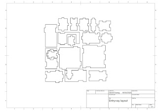
The Fusion 360 model with all components disassembled and converted into a drawing template.. I learned how to convert it into an Illustrator file ready for laser cutting.

24 March
My second handmade model of my study space, but in cardboard rather than paper. I experimented with different materials and found that cardboard was much thicker and sturdier than paper, but also more difficult to manipulate. This would inform my future decisions to make models in paper, as I enjoyed the flexibility of modelling with paper.

4 April
Paper model of the Fusion 360 prisms, at 1:1 scale. I started to become more familiar and skilled with the folding tabs style of modelling, which would aid me in all the paper models to come.
 
5 April
My first model which explored the effect of a new source of natural light in my room. I continued to develop my skills in the folding tabs technique, and the result is this model which was more refined than the previous Fusion 360 paper model. I also began to experiment with lighting in the context of photo taking.
 
 
10 April
My initials 3D model in Fusion 360. Here I experimented with different materials and textures in the software's rendering mode, as I continued to familiarise myself with Fusion 360's many capabilities. 

 10 April
My early attempt at photoshopping textures onto my paper model, and placing it in a virtual environment. Quite rough and unrefined, as expected. I didn't have the hang of perspective warping and realistic shadow making.

 11 April
A later photoshopping project, in which my handling of perspective and shadowing, among other things, has improved greatly since the earlier attempts. Both aspects are communicated much more convincingly and realistically, although with room for more improvement of course. 

14 April
Sketches and plans for my final model in the natural lighting series. Measurements of the room on the left. On the right, I was playing around with different options for skylights, and calculating their different sizes.

 14 April
My final paper model. I took a new approach with this one, in which I opened up a wall and left the ceiling in place. This allowed me to finally explore lighting from inside the room. At this stage, I had become very comfortable and skilled in paper modelling using folding tabs. 


Friday, April 24, 2020

100-Word Statement and Presentation

Statement

Illuminate, through paper modelling, explores how natural light can be introduced in ways that overcome a space’s limitations. It demonstrates that light in a room can be both functional and creative by considering the use of skylights and corner windows.

The model shows that a thoughtfully placed east-facing clerestory allows light in the morning, in addition to the afternoon light coming in through the original west-facing window. It also demonstrates the potential for creativity with lighting, as seen in the narrow ceiling-to-floor corner window that allows a ‘dramatic’ column of light to hit the opposing wall.

As such, Illuminate reveals that functionality and creativity need not be exclusive when creating natural light sources within a space and its limitations.


Presentation


Wednesday, April 22, 2020

Week 10 - Best Handmade Models

Model 1:
First model of my workspace/bedroom, at 1:20 scale. Paper.


Model 2:
Second model of my model at 1:20 scale, this time using cardboard.


Model 3:
1:1 paper folding tabs model of the Fusion 360 prisms.


Model 4:
1:30 paper model of my bedroom, with natural light source additions. 


Model 5:
Final paper model of my bedroom at 1:25 scale. Further exploring natural lighting from the perspective of being inside the room, rather than the outside looking in from the top.


Week 10 - Laser Cut Template and 3D Model

A screenshot of the laser cut model template

Screenshots of the 3D model STL file in Microsoft Print 3D


Tuesday, April 14, 2020

Week 9 - Expanding on the Lighting Model

This new model, built 1:25 scale, is another exercise in lighting. While it retains the 'column of light' corner notch from the previous light model, this one incorporates a new skylight in the ceiling (clerestory) that faces east in the direction of the morning sun - as my room is located at the back of the house, my window only receives the full brunt of sunlight in the evenings when it sets in the west.

The model also ditches the previous 'four walls, no ceiling' approach to my previous models, and instead I opted for 'three walls and a ceiling'. This allowed me to better examine the effects of lighting in the room with the constraints of a ceiling as well as giving me ease of access to 'indoor' photography.


The skylight uses laminate pouch to emulate frosted glass - the intention was to diffuse/soften the light so it wouldn't be too harsh when it enters in the morning.


The model allowed me to examine the same lighting modifications as my previous model but from a new perspective of being inside the room, rather than from the top looking in through the ceiling.


The printer paper was a bit of a troublesome material - its thinness allows some light to bleed through as well as allowing 'imperfections' (i.e. the folding tabs) to shine through. However, I was constrained by the lack of suitable materials at home, as even (cereal box) cardboard is in short supply at home. Nevertheless, I think the model still manages to achieve what it set out to do, and the results demonstrate the effects of natural lighting clearly.

Saturday, April 11, 2020

Week 8 - Photoshopped Models

 Model 1 - The two main materials I want to point out here are the plant walls and the sandstone walls. They're both materials that recall different parts of the Sydney I know - the plant wall being inspired by the vertical gardens at Central Park Mall, which is a go-to hangout spot for me and my friends; and the sandstone wall reminding me of the cliffs around the coast and beaches of the eastern suburbs, particularly La Perouse, which I often visit with my family in the summer evenings.


Model 2 - Here, we have three materials - Orange roof tiling, sandstone blocks, and a bas-relief from Angkor Wat. These materials are drawn from the temples (or 'wats') in Cambodia, with the sandstone and bas-relief from the historical Hindu temples of Angkor and the orange roof from the modern-day Buddhist pagodas that dot the Cambodian landscape. Thus these materials were chosen with the intention of reflecting my cultural background.


Model 3 - Finally, this model's materials consists of various ancient Egyptian tomb art. The image on the left wall is a particularly distinctive one for me personally - after all the books I scoured as a kid I could recognise it anywhere, being from the burial chamber of Tutankhamun. These materials were chosen to reflect my interest in ancient history.